
For sixty years the defining movement in Black American life ran north — out of the cotton South, up the rail lines to Chicago, Detroit, Cleveland, Harlem. The Great Migration built the twentieth-century Black metropolis, and the twentieth-century urban Democratic coalition with it. Then, quietly, the current turned. Between the censuses of 2000 and 2020 — the first count to let Americans mark more than one race, and the most recent — the turn hardened into a structure. The census counted 36,419,434 Black Americans in 2000 and 46,936,733 in 2020, and the growth ran overwhelmingly through the metropolitan South while the counties the Great Migration built lost Black residents by the hundred thousand.
Polling can only estimate what a group did after the fact, inside a margin of error that swallows most of the story. The census is a different instrument: a full enumeration, taken twice on the same terms, twenty years apart. It cannot say how anyone votes. Read against certified county returns, it can say something surveys cannot — which places changed because minds changed, and which changed because the people did.
Two disciplines before the map. The count throughout is Black alone or in combination with one or more other races: 2000 was the first census that let respondents mark more than one race, so it is the earliest count comparable to 2020, and the combined figure is the stable one across the two decades. And the census counts residents — children, non-citizens, non-voters alike — so what follows measures the composition of places, not of electorates. The distinction does real work, and the returns will do theirs.
The belt and the rings
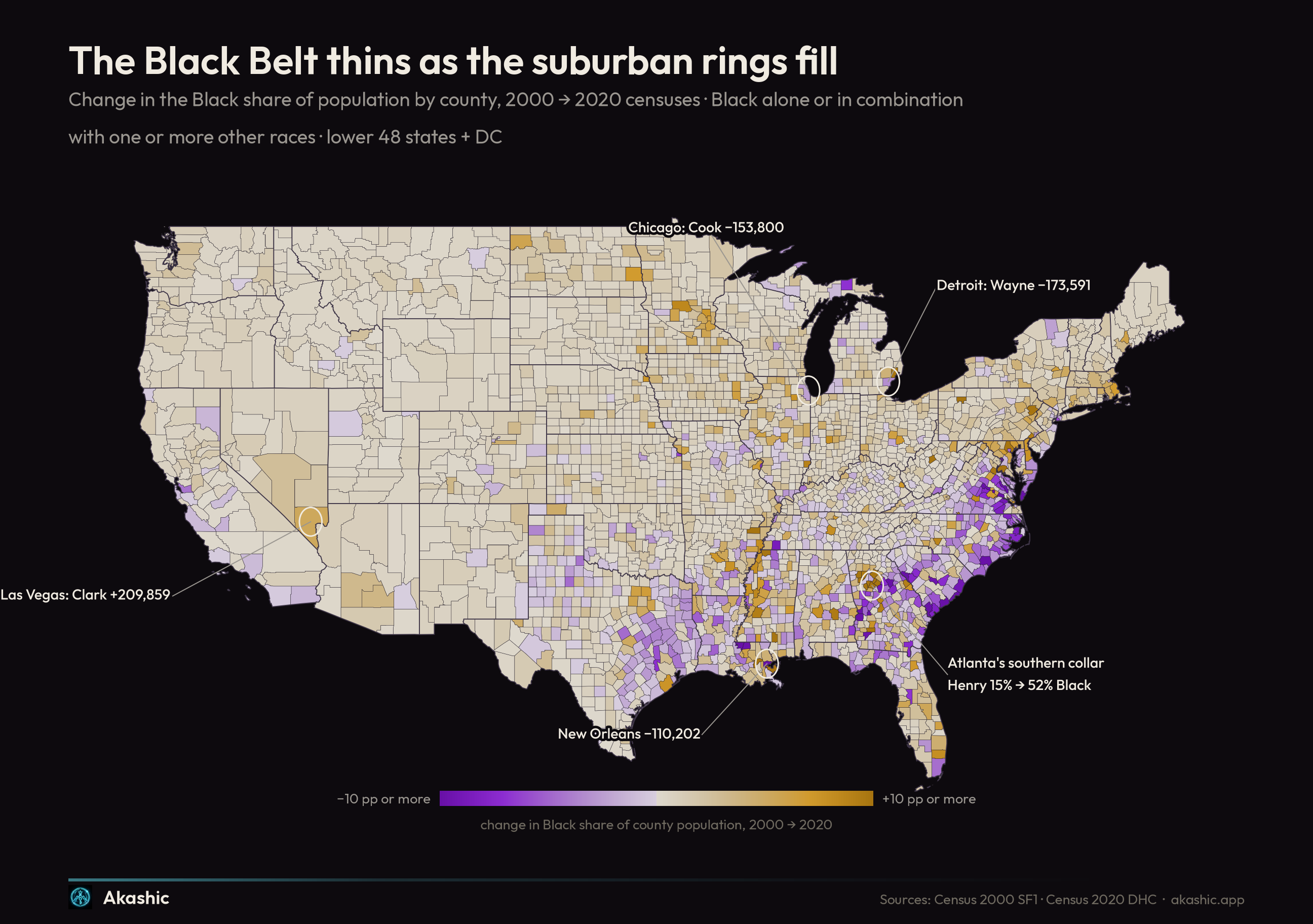
The Census Bureau's current national geography contains 3,144 counties and county equivalents. This historical comparison uses a narrower, harmonized panel: 3,136 county or county-equivalent footprints whose 2000 and 2020 populations can be compared on consistent boundaries. Of those, 2,550 held a larger Black population in 2020, 581 a smaller one, and five were unchanged. The violet on this map is not where you might first look for it. It runs through the oldest Black geography in America — Virginia's Southside, the Carolina coastal plain, the Georgia and Alabama Black Belt, the Mississippi Delta — the plantation crescent that held the center of Black population for two centuries. The rural South kept thinning, as it has since the first northbound trains. What reversed is the destination: the growth pooled not in Northern cities but in Southern metros, and within them not in the core counties but in the rings around them.
The return, in other words, is precise about where it is going. It is a return to the South, but not to the land — to Henry County, not Hancock County.
The county ledger makes the two ends of the current legible:
The ten largest county gains
| County | Black population 2000 | 2020 | Change | Share 2000 → 2020 |
|---|---|---|---|---|
| Harris County, TX | 645,290 | 981,484 | +336,194 | 19.0% → 20.8% |
| Broward County, FL | 360,611 | 587,444 | +226,833 | 22.2% → 30.2% |
| Tarrant County, TX | 192,589 | 404,404 | +211,815 | 13.3% → 19.2% |
| Clark County, NV | 137,477 | 347,336 | +209,859 | 10.0% → 15.3% |
| Gwinnett County, GA | 81,804 | 287,687 | +205,883 | 13.9% → 30.1% |
| Maricopa County, AZ | 132,198 | 335,335 | +203,137 | 4.3% → 7.6% |
| Mecklenburg County, NC | 197,788 | 355,707 | +157,919 | 28.4% → 31.9% |
| Dallas County, TX | 462,609 | 611,735 | +149,126 | 20.9% → 23.4% |
| Orange County, FL | 175,171 | 318,041 | +142,870 | 19.5% → 22.2% |
| Franklin County, OH | 204,385 | 336,958 | +132,573 | 19.1% → 25.4% |
The ten largest county losses
| County | Black population 2000 | 2020 | Change | Share 2000 → 2020 |
|---|---|---|---|---|
| Wayne County, MI | 886,289 | 712,698 | −173,591 | 43.0% → 39.7% |
| Cook County, IL | 1,435,781 | 1,281,981 | −153,800 | 26.7% → 24.3% |
| Orleans Parish, LA | 329,171 | 218,969 | −110,202 | 67.9% → 57.0% |
| Baltimore city, MD | 424,449 | 353,890 | −70,559 | 65.2% → 60.4% |
| Kings County, NY | 939,316 | 874,009 | −65,307 | 38.1% → 31.9% |
| Los Angeles County, CA | 999,747 | 944,640 | −55,107 | 10.5% → 9.4% |
| District of Columbia, DC | 350,455 | 304,543 | −45,912 | 61.3% → 44.2% |
| St. Louis city, MO | 181,503 | 137,059 | −44,444 | 52.1% → 45.5% |
| Alameda County, CA | 233,484 | 198,654 | −34,830 | 16.2% → 11.8% |
| Miami-Dade County, FL | 487,015 | 459,239 | −27,776 | 21.6% → 17.0% |
Each of these losses has its own mechanics. Orleans Parish is the list's singular event: 118,724 of its loss came in the decade of Katrina, and part of it has since come back — 8,522 Black residents regained from 2010 to 2020. It is the one loss on this list made by water rather than by choice. The District of Columbia is a different structural marker: D.C. was 61.3 percent Black in 2000, fell below half in the 2010s, and stood at 44.2 percent in 2020 — the only state-level jurisdiction in this analysis whose Black population shrank over the two decades. And Miami-Dade closes the table with a warning against reading the South as one story: a Southern county, losing Black population, as its Hispanic population grows.
Where a million people landed
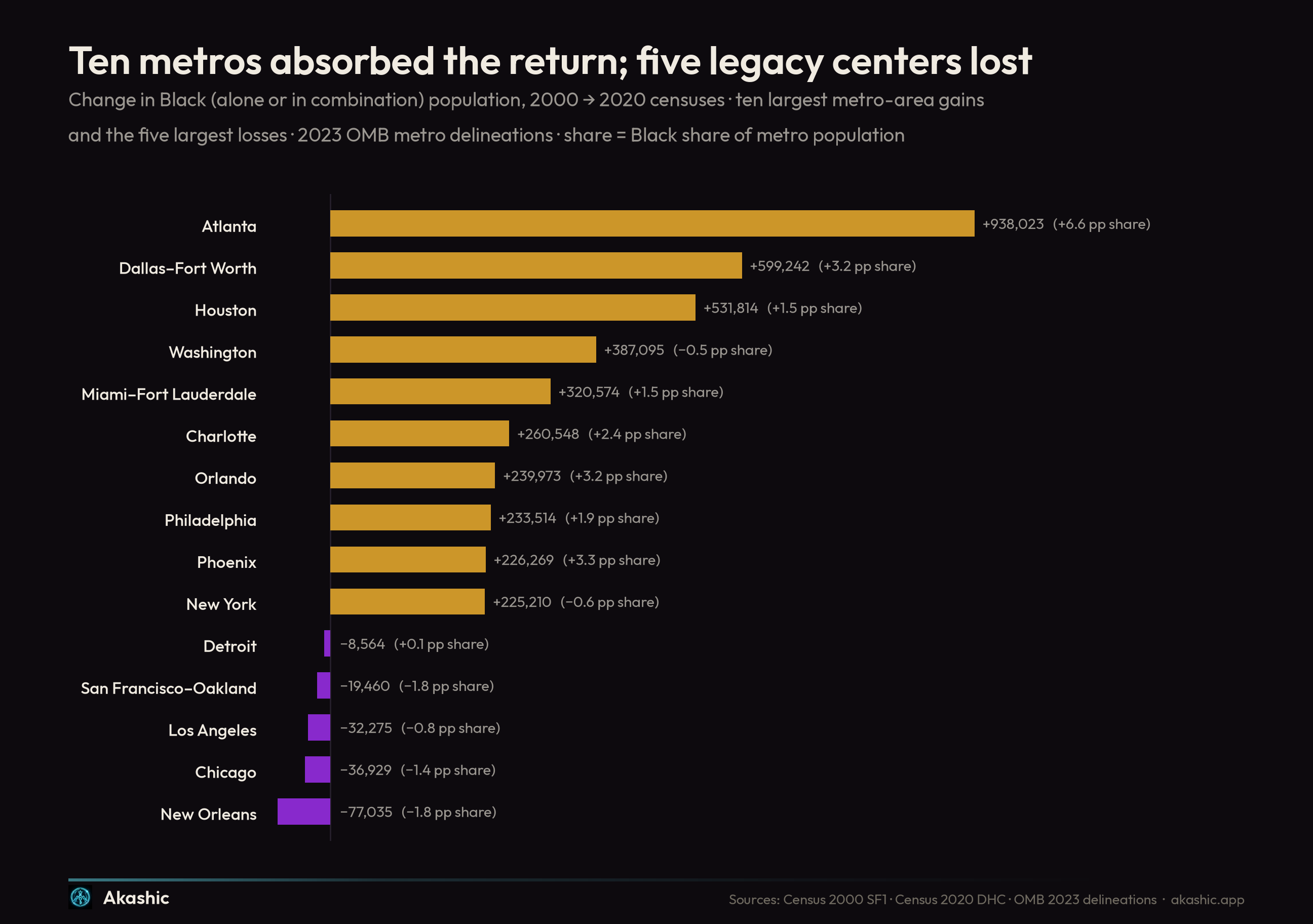
Aggregate the counties to metro areas and the destination resolves. Atlanta gained 938,023 Black residents between the two censuses — within reach of a million people in twenty years — and went from 29.1 to 35.8 percent Black. Dallas–Fort Worth added 599,242, Houston 531,814, Washington 387,095. The South holds the top seven rows of the table.
| Metro | Black population 2000 | 2020 | Change | Share change |
|---|---|---|---|---|
| Atlanta-Sandy Springs-Roswell, GA | 1,244,257 | 2,182,280 | +938,023 | +6.6 pp |
| Dallas-Fort Worth-Arlington, TX | 740,393 | 1,339,635 | +599,242 | +3.2 pp |
| Houston-Pasadena-The Woodlands, TX | 816,367 | 1,348,181 | +531,814 | +1.5 pp |
| Washington-Arlington-Alexandria, DC-VA-MD-WV | 1,318,083 | 1,705,178 | +387,095 | −0.5 pp |
| Miami-Fort Lauderdale-West Palm Beach, FL | 1,016,211 | 1,336,785 | +320,574 | +1.5 pp |
| Charlotte-Concord-Gastonia, NC-SC | 373,757 | 634,305 | +260,548 | +2.4 pp |
| Orlando-Kissimmee-Sanford, FL | 245,054 | 485,027 | +239,973 | +3.2 pp |
| Philadelphia-Camden-Wilmington, PA-NJ-DE-MD | 1,174,429 | 1,407,943 | +233,514 | +1.9 pp |
| Phoenix-Mesa-Chandler, AZ | 137,766 | 364,035 | +226,269 | +3.3 pp |
| New York-Newark-Jersey City, NY-NJ | 3,556,933 | 3,782,143 | +225,210 | −0.6 pp |
| New Orleans-Metairie, LA | 488,844 | 411,809 | −77,035 | −1.8 pp |
| Chicago-Naperville-Elgin, IL-IN | 1,729,592 | 1,692,663 | −36,929 | −1.4 pp |
| Los Angeles-Long Beach-Anaheim, CA | 1,059,173 | 1,026,898 | −32,275 | −0.8 pp |
| San Francisco-Oakland-Fremont, CA | 435,935 | 416,475 | −19,460 | −1.8 pp |
| Detroit-Warren-Dearborn, MI | 1,043,252 | 1,034,688 | −8,564 | +0.1 pp |
But the table holds its own dissent, and the dissent keeps the reading honest. Las Vegas added 209,859 and Phoenix 226,269 — the West's share of Black America rose from 9.6 to 10.3 percent, and no one calls Nevada a return. Minneapolis–St. Paul added 219,867 and went from 6.1 to 11.0 percent Black. The South took 60.4 percent of the two decades' growth — 6,353,381 of the 10.5 million, raising its share of Black America from 53.6 to 55.1 percent — but the truest single word for the movement is not southern. It is metropolitan, with the South as its center of gravity.
The city line
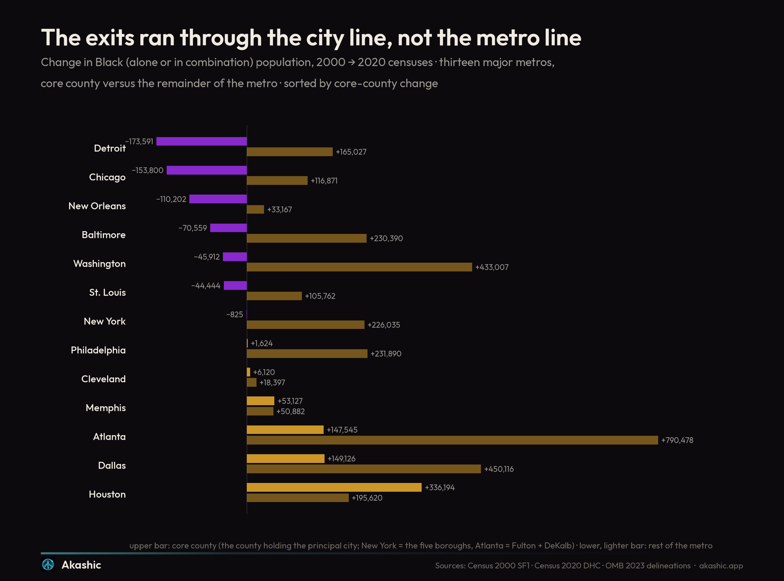
Now watch where the losses actually live. Wayne County shed 173,591 Black residents — and the rest of the Detroit metro gained 165,027, leaving the metro as a whole down just 8,564. Detroit's Black exodus, the largest county loss in America, barely crossed its own metro line. The five boroughs of New York lost 825 Black residents — effectively zero — while the metro's suburban remainder gained 226,035. Baltimore city lost 70,559 while its suburbs gained 230,390; the District lost 45,912 while greater Washington's suburbs gained 433,007. Even St. Louis city and Cook County sit against suburban gains — 105,762 and 116,871 across their own metro remainders.
This is the finding that the exodus framing misses. What looks on a city map like departure is, at metro scale, mostly a short move — across a county line, out of the apartment belt, into a subdivision. The Great Migration's grandchildren are not so much leaving Detroit and Chicago and Baltimore as leaving the county, the same outward step the white middle class took two generations earlier, made by the people that step was once designed to exclude.
Around Atlanta, the demonstration
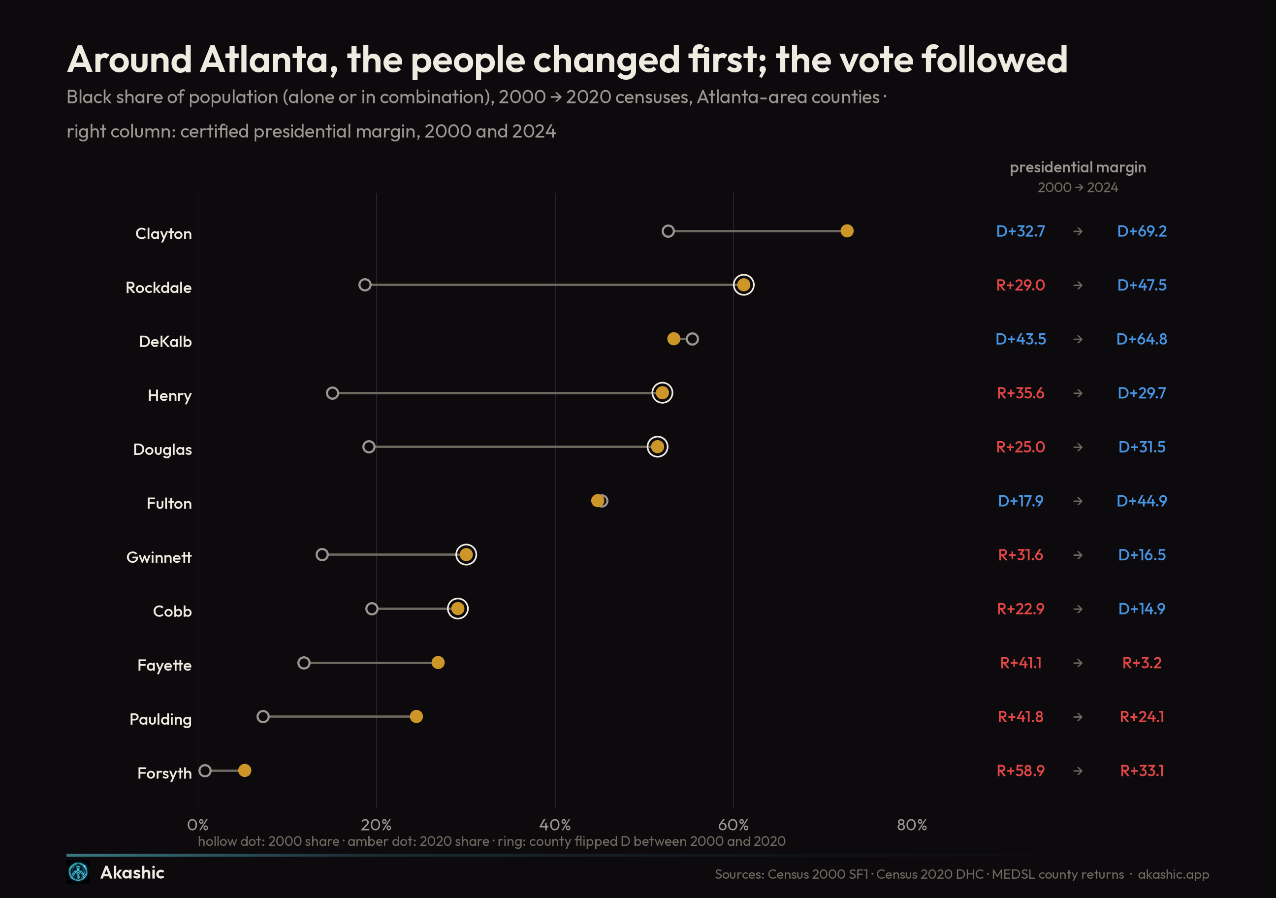
If the return has a capital it is the southern collar of Atlanta, and the collar is where the census and the returns snap together.
| County | Black share 2000 | 2020 | Presidential margin 2000 | 2020 | 2024 |
|---|---|---|---|---|---|
| Clayton County, GA | 52.7% | 72.7% | D+32.7 | D+70.9 | D+69.2 |
| DeKalb County, GA | 55.3% | 53.3% | D+43.5 | D+67.4 | D+64.8 |
| Fulton County, GA | 45.2% | 44.8% | D+17.9 | D+46.5 | D+44.9 |
| Rockdale County, GA | 18.7% | 61.1% | R+29.0 | D+40.8 | D+47.5 |
| Henry County, GA | 15.1% | 52.0% | R+35.6 | D+20.4 | D+29.7 |
| Douglas County, GA | 19.1% | 51.5% | R+25.0 | D+25.1 | D+31.5 |
| Gwinnett County, GA | 13.9% | 30.1% | R+31.6 | D+18.2 | D+16.5 |
| Cobb County, GA | 19.4% | 29.1% | R+22.9 | D+14.3 | D+14.9 |
| Fayette County, GA | 11.9% | 26.9% | R+41.1 | R+6.8 | R+3.2 |
| Paulding County, GA | 7.3% | 24.5% | R+41.8 | R+29.1 | R+24.1 |
| Forsyth County, GA | 0.8% | 5.3% | R+58.9 | R+33.2 | R+33.1 |
Rockdale County went from 18.7 percent Black to 61.1 — from one-in-five to a supermajority in twenty years — and its presidential margin moved seventy-six points, R+29.0 to D+47.5. Henry: 15.1 to 52.0 percent, R+35.6 to D+29.7. Douglas: 19.1 to 51.5, R+25.0 to D+31.5. These are not swing counties; they are counties whose electorate was replaced under the incumbent map, the cleanest demonstrations in the country that a margin can move because the people holding it moved.
Read the table's edges as carefully as its center, because they are where the mechanism gets honest. Fayette and Paulding took the same demographic current — to 26.9 and 24.5 percent Black — and did not flip; they merely traveled thirty-eight and eighteen points. Composition bends a county's politics; it does not schedule the crossing. At the other edge, DeKalb and Fulton moved twenty-one and twenty-seven points toward the Democrats while their Black share fell slightly — there, conversion and a different in-migration did the work, not Black population growth. And Forsyth County sits at the top of the chart like a message from the deep record: the county that expelled virtually its entire Black population in 1912 and kept it near zero for eight decades was 0.8 percent Black in 2000, 5.3 percent in 2020 — and still voted R+33.1. The tide reaches even there; it has not remade even there.
Statewide, the ledger reads: Georgia added 1,144,721 Black residents over the two decades, its Black share rising from 29.2 to 33.0 percent, while its presidential margin went from R+11.7 in 2000 to D+0.2 in 2020 and R+2.2 in 2024. Georgia did not become the closest state in America by persuasion alone. Its people changed.
2024, against the tide
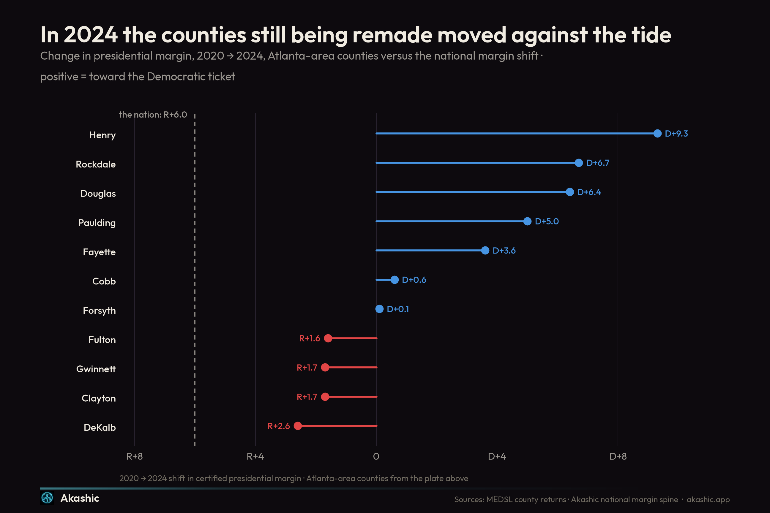
The 2024 election put the mechanism under stress and split it open. The national margin moved six points toward the Republican ticket — D+4.5 in 2020 to R+1.5. The settled, majority-Black cores of the Atlanta table moved with the country, modestly: Clayton slipped 1.7 points, DeKalb 2.6, Fulton 1.6 — the local trace of the national softening in Black voters' Democratic margins that the 2024 polling and validated-voter work has documented. But the counties where the return is still landing moved the other way. Henry shifted 9.3 points further Democratic against a six-point national tide; Rockdale 6.7; Douglas 6.4; even unflipped Paulding and Fayette moved 5.0 and 3.6 toward the Democrats.
Label the reading plainly: this is interpretation, not measurement, but it is the interpretation the two datasets jointly insist on. Where the electorate is settled, 2024's persuasion story played out — margins drifting right, including among Black voters. Where the electorate is still being rebuilt by arrival, composition outran conversion, and the map moved left through a Republican year. Polling measures the first force and largely cannot see the second; it shows up only when you put the census under the returns.
The battlegrounds, reweighed
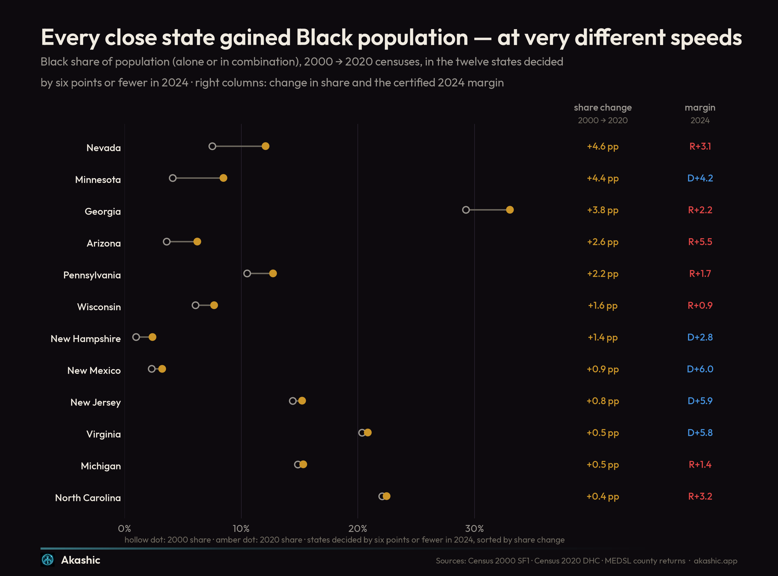
Widen the lens from one metro to the whole competitive map. Twelve states were decided by six points or fewer in 2024, and every one of them counted more Black residents in 2020 than in 2000. The return does not sort the battlegrounds into gainers and losers. It sorts them by speed.
| State | Black population 2000 | 2020 | Change | Share 2000 → 2020 | 2000 | 2020 | 2024 |
|---|---|---|---|---|---|---|---|
| Wisconsin | 326,506 | 452,743 | +126,237 | 6.1% → 7.7% | D+0.2 | D+0.6 | R+0.9 |
| Michigan | 1,474,613 | 1,544,122 | +69,509 | 14.8% → 15.3% | D+5.1 | D+2.8 | R+1.4 |
| Pennsylvania | 1,289,123 | 1,655,034 | +365,911 | 10.5% → 12.7% | D+4.2 | D+1.2 | R+1.7 |
| Georgia | 2,393,425 | 3,538,146 | +1,144,721 | 29.2% → 33.0% | R+11.7 | D+0.2 | R+2.2 |
| New Hampshire | 12,218 | 32,998 | +20,780 | 1.0% → 2.4% | R+1.3 | D+7.4 | D+2.8 |
| Nevada | 150,508 | 375,198 | +224,690 | 7.5% → 12.1% | R+3.5 | D+2.4 | R+3.1 |
| North Carolina | 1,776,283 | 2,344,553 | +568,270 | 22.1% → 22.5% | R+12.8 | R+1.3 | R+3.2 |
| Minnesota | 202,972 | 483,646 | +280,674 | 4.1% → 8.5% | D+2.4 | D+7.1 | D+4.2 |
| Arizona | 185,599 | 446,394 | +260,795 | 3.6% → 6.2% | R+6.3 | D+0.3 | R+5.5 |
| Virginia | 1,441,207 | 1,799,960 | +358,753 | 20.4% → 20.9% | R+8.1 | D+10.1 | D+5.8 |
| New Jersey | 1,211,750 | 1,413,772 | +202,022 | 14.4% → 15.2% | D+15.8 | D+15.9 | D+5.9 |
| New Mexico | 42,412 | 68,409 | +25,997 | 2.3% → 3.2% | D+0.1 | D+10.8 | D+6.0 |
The fast lane is not where convention puts it. Nevada reweighted hardest of all twelve — 7.5 to 12.1 percent Black, +224,690 people, nearly all of it Clark County — and Minnesota is right behind it, 4.1 to 8.5 percent on a gain of 280,674. Georgia is the only state that is both enormous in absolute terms and fast in share: +1,144,721 and 29.2 to 33.0 percent, now far the Blackest state on the competitive map. Arizona went 3.6 to 6.2. Pennsylvania is the northern hybrid: +365,911 — the largest Blue Wall gain — led not by Philadelphia itself but by Delaware County at +56,976, the Philadelphia collar echoing Atlanta's at lower amplitude.
The slow lane holds its own surprises. Michigan gained just 69,509 — a half-point of share — but its interior is the Detroit swap again, and the receiving county is the one political science spent a generation treating as the home ground of the white Reagan Democrat: Macomb County, +99,063 Black residents since 2000, the largest Black gain of any county in the three Blue Wall states. North Carolina is the inverse case — the second-largest absolute gain among the twelve, +568,270, and yet its share barely moved, 22.1 to 22.5 percent, because every other population arrived at the same pace. And Virginia is the control: share flat at about twenty percent while the state walked from R+8.1 to D+5.8 — a move made in Northern Virginia by forces this essay's measure barely registers, a reminder that composition has more than one color of ink.
Read as one panel, the twelve say something none says alone. The three Blue Wall states all drifted from the Democratic to the Republican column across the quarter-century — Michigan D+5.1 to R+1.4, Pennsylvania D+4.2 to R+1.7, Wisconsin D+0.2 to R+0.9 — while their Black shares moved between half a point and just over two. The two old-Confederacy battlegrounds moved nearly ten points the other way — Georgia from R+11.7 to R+2.2, North Carolina from R+12.8 to R+3.2 — as the return ran through them. The competitive map is not converging on one story; its two halves are trading places, and they are doing it at the speed of their demography, not the speed of their news cycles.
The districts underneath
House districts resist this kind of reading, and for a reason worth stating: they have been redrawn three times since 2000, so "how did this district change" is usually a question about mapmakers, not people. The atlas's answer is to hold today's lines still — the district map the 2026 election will actually be fought on — and pour the history into them: presidential returns allocated onto current boundaries through the audited block geography, and, from this essay's county panel, an exposure score for every district — the average of its counties' 2000→2020 change in Black population share, weighted by the exact 2020-census population of each county-within-district piece. Where a state has redrawn its lines since the Census's district tabulation — Texas, California, Florida, and Ohio among them — the weights fall back to a labeled area-based approximation. Either way, exposure remains an approximation of one honest kind: the change signal is whole-county, so a district can take the slower-changing slice of a fast-changing county and the score cannot see that.
What completion looks like, first. Georgia's 13th — Henry, Rockdale, Newton, and their neighbors, the southern collar drawn as one seat — voted R+9.2 for president in 2000 on its current lines and D+42.2 in 2024, a fifty-one point crossing inside a fixed frame, with an exposure of +23 pp and a majority-Black population today. No mapmaker did that. The road exists, and one district has driven it end to end.
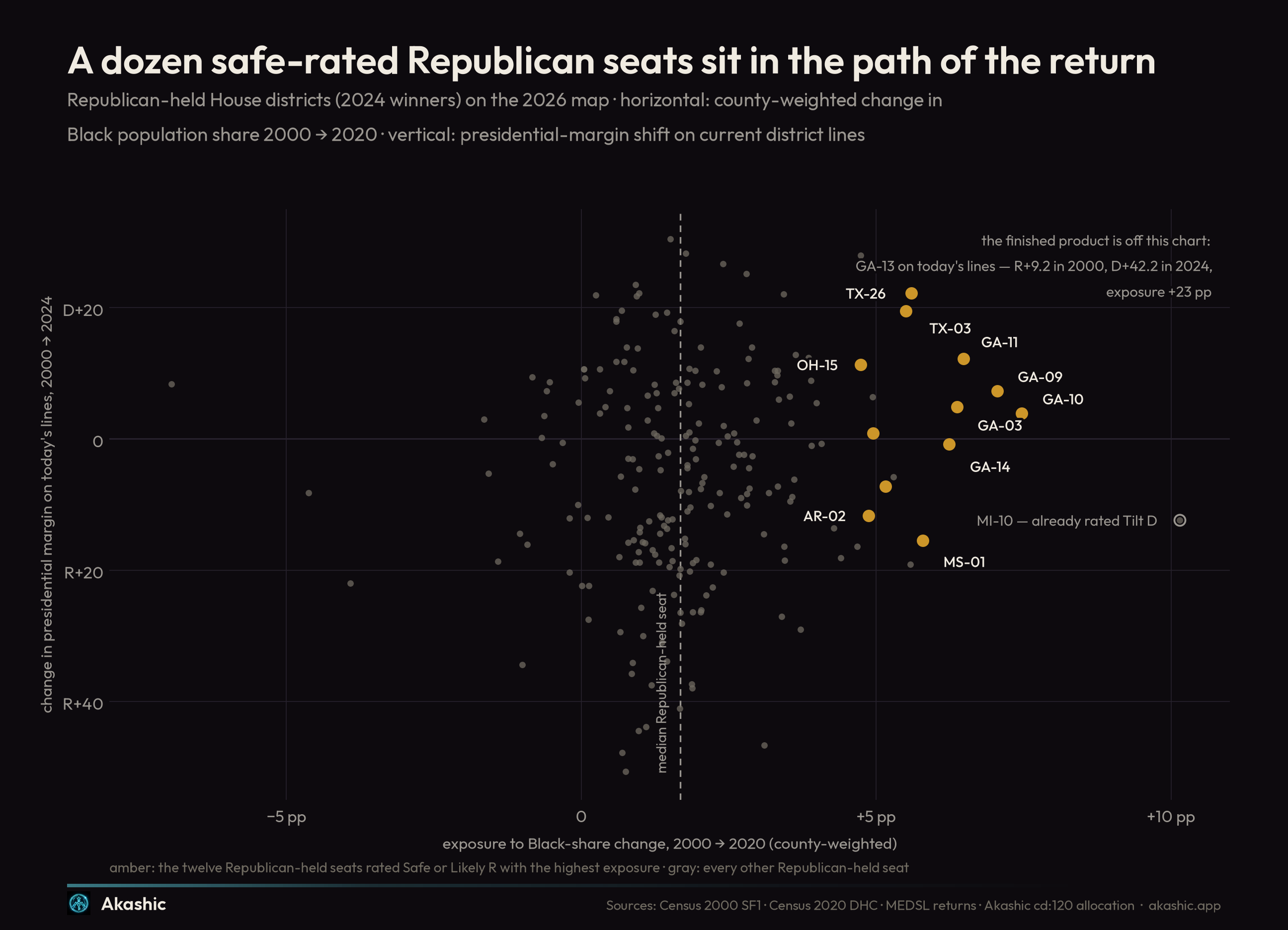
Now screen for the seats where the same force is working and nobody is priced for it. Republicans won 220 of the 435 districts on this map in 2024; the median Republican seat has an exposure of +1.7 pp. Take only the seats Akashic's edition 4 rates Safe or Likely Republican — the ones the forecast expects to stay boring — and rank them by exposure:
| District | Exposure | Black share (ACS 2024) | Presidential 2000 → 2024 | 24-year shift | House 2024 | 2026 rating |
|---|---|---|---|---|---|---|
| GA-10 | +7.5 pp | 23.6% | R+24.7 → R+20.8 | +3.9 | R+26.1 | Safe R |
| GA-09 | +7.0 pp | 12.2% | R+41.4 → R+34.1 | +7.3 | R+38.0 | Safe R |
| GA-11 | +6.5 pp | 11.7% | R+35.5 → R+23.3 | +12.2 | R+34.6 | Safe R |
| GA-03 | +6.4 pp | 22.9% | R+34.6 → R+29.7 | +4.9 | R+32.6 | Safe R |
| GA-14 | +6.2 pp | 12.1% | R+36.0 → R+36.8 | −0.8 | R+28.7 | Safe R |
| MS-01 | +5.8 pp | 27.3% | R+21.5 → R+37.0 | −15.5 | R+39.6 | Safe R |
| TX-26 | +5.6 pp | 10.0% | R+46.0 → R+23.8 | +22.2 | R+26.4 | Safe R |
| TX-03 | +5.5 pp | 10.7% | R+42.9 → R+23.4 | +19.5 | R+24.9 | Safe R |
| MN-06 | +5.2 pp | 4.6% | R+12.4 → R+19.6 | −7.2 | R+25.0 | Safe R |
| TX-12 | +5.0 pp | 9.4% | R+24.8 → R+23.9 | +0.9 | R+26.9 | Safe R |
| AR-02 | +4.9 pp | 20.4% | R+3.8 → R+15.5 | −11.7 | R+17.9 | Safe R |
| OH-15 | +4.7 pp | 11.2% | R+21.3 → R+10.0 | +11.3 | R+12.9 | Likely R |
Five of the twelve are Georgia seats ringing the Atlanta collar — the return's capital, cut into congressional slices. GA-11 carries forty-two percent of Cobb and most of Cherokee, and has already moved 12.2 points Democratic on fixed lines. GA-03 carries most of Fayette, the collar county that traveled thirty-eight points without flipping. GA-10 is the collar's eastern spillover, the counties past Rockdale and Newton, and posts the highest exposure of any safe-rated seat in America at +7.5 pp. GA-09 leans on thirty-eight percent of Gwinnett — and is also the plainest illustration of the metric's limit, since the seat takes Gwinnett's exurban edge, not its core.
The two Texas seats are where "unexpectedly" earns its adjective. TX-26 — Denton County's seat — voted R+46.0 for president in 2000 on its current lines and R+23.8 in 2024: a 22.2-point Democratic shift, the largest of any safe-rated Republican seat on the list, in the same exurban corridor the migration essay found absorbing the country's largest inflows. TX-03, built on Collin County, has moved 19.5 — its exposure carrying the area-based label, since Texas has redrawn since the census district tabulation. Both are still R+24-ish and rated safe, and both are exactly what GA-11 looked like a decade ago: not close, just relentlessly closing. And at the bottom of the table sits its quietest surprise: OH-15, fifty-nine percent of Columbus's Franklin County and its western ring, already down to R+10.0 for president and R+12.9 for the House after an 11.3-point Democratic walk — the closest seat on the list, and the only one the forecast has already nudged to Likely rather than Safe.
And the table carries its own refutation, which is why it can be trusted. MS-01, where Memphis's Black suburbanization spills into DeSoto County, has moved 15.5 points Republican on fixed lines — the realignment of the district's white electorate outran its composition change. AR-02, holding seventy percent of Little Rock's Pulaski County, moved 11.7 points Republican the same way; MN-06, 7.2. Exposure is pressure, not verdict. Where the two forces pull the same way — the Georgia five, the Texas pair, OH-15 — the pressure compounds; where they oppose, persuasion has been winning. It is worth adding that the single highest-exposure Republican seat in the country, MI-10 at +10.2 pp on forty percent of Macomb County, is not on this list because the forecast already rates it Tilt D — at the top of the scale, the model and the census agree. The watchlist is the shelf below, where they do not yet.
Almost none of these twelve is close today; the House margins run from R+12.9 to R+39.6. That is the point of a watchlist. If one of them is competitive in 2026 or 2028 — an open seat, a scandal, a redistricting court order, a national wave — the surprise will have had twenty years of preparation, and the preparation is what this table measures.
2026, then 2028
The 2026 ballot happens to run straight through the fast lane. What follows cites Akashic's 2026 Midterm Forecast, edition 4, locked August 21, 2026 — model output, not this essay's finding, and subject to later editions.
| State | Contest | Seat | Rating |
|---|---|---|---|
| Wisconsin | Governor | open (D) | Tilt D |
| Michigan | U.S. Senate | open (D) | Lean D |
| Michigan | Governor | open (D) | Tilt D |
| Pennsylvania | Governor | D incumbent | Safe D |
| Georgia | U.S. Senate | D incumbent | Likely D |
| Georgia | Governor | open (R) | Tilt D |
| New Hampshire | U.S. Senate | open (D) | Likely D |
| New Hampshire | Governor | R incumbent | Tilt R |
| Nevada | Governor | R incumbent | Tilt D |
| North Carolina | U.S. Senate | open (R) | Safe D |
| Minnesota | U.S. Senate | open (D) | Likely D |
| Minnesota | Governor | open (D) | Safe D |
| Arizona | Governor | D incumbent | Lean D |
| Virginia | U.S. Senate | D incumbent | Safe D |
| New Jersey | U.S. Senate | D incumbent | Safe D |
| New Mexico | U.S. Senate | D incumbent | Safe D |
| New Mexico | Governor | open (D) | Safe D |
Georgia carries the heaviest load: a Democratic Senate defense the current edition rates Likely D, and an open governor's chair after a term-limited Republican, rated Tilt D — two statewide contests in the state where thirty-three percent of the population is now Black and the last two presidential margins were 0.2 and 2.2 points. Michigan stacks an open Senate seat (Lean D) on an open governorship (Tilt D) in the Blue Wall state where composition has moved least. North Carolina's open Republican Senate seat — rated Safe D in the current edition — sits in the state where half a million new Black residents have so far reweighted almost nothing. The governor's map adds Nevada, the fastest-reweighting state on the panel, and Arizona.
A midterm asks a specific question of a still-arriving electorate: does it show up without a presidential ballot? Georgia has already run that experiment once. In the November 2022 Senate general — Raphael Warnock against Herschel Walker, before the runoff — every one of the eleven counties on the Atlanta table above voted more Democratic than it had for president in 2020: Henry D+29.3 against D+20.4, Rockdale D+48.2 against D+40.8, and so on down to Forsyth, while the state moved from D+0.2 to D+1.0. A candidate pairing that lopsided in quality cautions against reading the 2022 result as composition alone. But the direction, in all eleven counties at once, is the direction the census had already written down.
On 2028, this essay will not pretend to forecast; it will say what the record makes mechanical. The people who will reweight the 2028 electorate have, for the most part, already moved — composition is the slowest of the three forces, and two decades of it are already banked in the table above. The two roads to 270 electoral votes now run over demographically diverging ground: the Sun Belt road through Georgia, North Carolina, Arizona, and Nevada, where Black population is arriving at scale; the northern road through Michigan and Wisconsin, where the same force is mild, with Pennsylvania as the hybrid between them. If the pattern of 2024 — composition outrunning conversion precisely where arrival is still under way — holds, Georgia is where it will be tested first and hardest, and its 2026 double ballot is the next reading. If it breaks, that too will be visible in the same counties, and the 2030 census will re-weight not just the states' electorates but the Electoral College itself.
The slowest poll
One caution and one conclusion. The caution is the ecological one, and it cuts both ways: none of this says how any individual votes, and none of it treats Black voters as a bloc — Clayton County is 72.7 percent Black and voted D+69.2, not D+100, and the 2024 drift in the cores is itself evidence of a Black electorate in motion politically as well as geographically. Composition is one force among the three that move a county — arrival, persuasion, turnout — and this essay has isolated it, not crowned it.
The conclusion is about instruments. The census is the slowest poll in American politics: it asks a single question — who is here — and answers elections at a time. Between 2000 and 2020 its answer moved ten and a half million people's worth of weight across the map: out of the rural Black Belt, out of the Great Migration counties, into the suburban South. The 2026 midterms and the 2028 cycle will be polled within an inch of their lives, and the polling will argue, as it always does, about persuasion. The counties of the southern collar argue for watching the other force — the one that files no daily tracker and reverses no news cycle, and that has flipped five Georgia counties in twenty years by the oldest method there is. The next reading arrives in 2030.